Currensee
A Budgeting App for multi-country travel needs
Platform
Mobile
Role
Research
Prototyping
UX Design
UI Design
Tools
Adobe XD
Illustrator
Photoshop
Sector
Travel

Introducing: Currensee
Overview
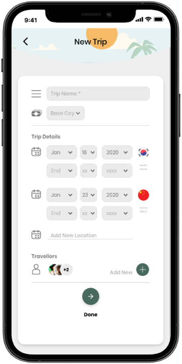
Currensee is a mobile app that allows users to plan a multi-destination trip and manage various currencies with ease while budgeting their expenses.
The Why
A while back when I was on vacation in Asia, I discovered something - there wasn’t a tool that could help me budget and keep track of my multi-destination trip, before and during my trip. And I’m not the only one.
Following the rapid development and economic growth around the world, travel is no longer a means of luxury. More and more individuals are now traveling overseas, and taking multi-country trips in line with new trends like ‘back-packing.
What did that mean?
The current market doesn’t offer a system that can plan a multi-country, multi-currency trip.
Context / User Research
Understanding the market
To better understand the user scope, and what people are using nowadays, I started by researching into what was currently available.
👉🏻 I wanted to understand how and if competitors have tackled this problem.
👉🏻 The analysis helped me learn the details of competitor services, and identified potential opportunities where Currensee could out-perform and fill the gaps.
Why Competitive Analysis?
Key Findings
Analyzing 3 popular travel budgeting apps, here are the general findings:
Speaking with travelers
The results of the market research showed there were a few options available for users, however, in soliciting feedback from fellow travellers, there were a few standout common commentary:
User Persona
Cindys Goals:
Cindy is hoping to spend the remaining funds she’s made during university on a long trip to a couple different countries, before she comes home and starts job-hunting. Her priority is knowing how much she’s spent at each moment of her trip, so she can keep track if she’ll have enough later down the line.
Cindys Frustrations:
Its unclear how she’ll keep track of her spendings in different currencies.
She wants to ensure unspent funds can be carried over to the next leg of her trip.
Its difficult to manage card spendings back home in her own currency and in-person spendings in foreign countries together.
Design Goals
Taking these pain points and needs into account, there were a few identified goals that this app aims to achieve:
A way for users to add multiple currencies to one budget
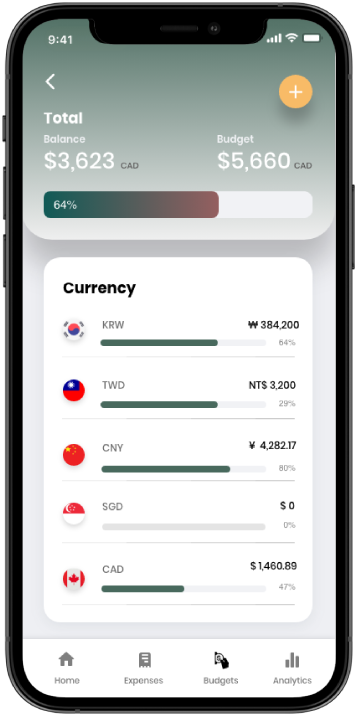
A way for users to see at a glance expenses in relation to home currency
A way for users to input and analyze expenses from multiple legs of a trip.

High Fidelity Prototype
Editable & Updateable Budgets
Users are able to easily see their budget utilization at a glance on the app home. They can also easily update their budgets in different currencies, increasing and adding new ones as needed.
Onboarding
Simplified Expenses
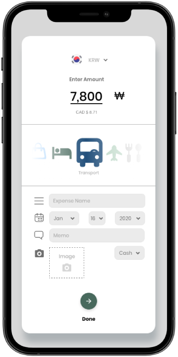
Expenses are easily entered via the quick FAB button, with ability to choose currency usage and cash vs credit/debit.
Analytics
Users can view all their expenses for their trip based on different parameters such as by currency, date, and category, making it easy to see metrics at a glance.
The Design Solution
With the research, persona and goals in mind - the high-fidelity prototype was developed after rounds of iterations in the lo-fi stage.


Visual identity
The visual design played a pivotal role, as it greatly influences user perception, engagement, and usability. Aesthetic appeal and intuitive layouts made complex user flows more appealing to users, enhancing their overall experience. A simple use of teal green and highlights of yellow was chosen as the main colour palette.
🤔 Personal Takeaways
Simplifying through design
Designing this app reaffirmed for me once again the importance of user-centric design, and delivering solutions to user problems, in a way that can be more approachable by a wide range of audiences.
The power of Visual Attraction
People want to use apps that not only work - but look visually pleasing. When an app is easy on the eyes, it causes less strain for the users, theres a fine balance between looking like too much!
Next Steps
Engaging in usability testing - Much of the decisions made for this interface have been based on personal insights and user interviews at the start of the project. As a next step, testing the assumptions and validating the user experience choices would be crucial to locate any potential pain points for further iteration.


